Adding one social handle is straightforward. Adding three or four without turning the card into an eye chart is where most people struggle. Tiny icons, microscopic text, missing CTAs, and handles that changed six months ago are all common results.
This guide covers three proven display methods, how to choose which platforms to include, the design variables that separate polished from cluttered, and the mistakes worth avoiding before you send a print order.
Key Takeaways
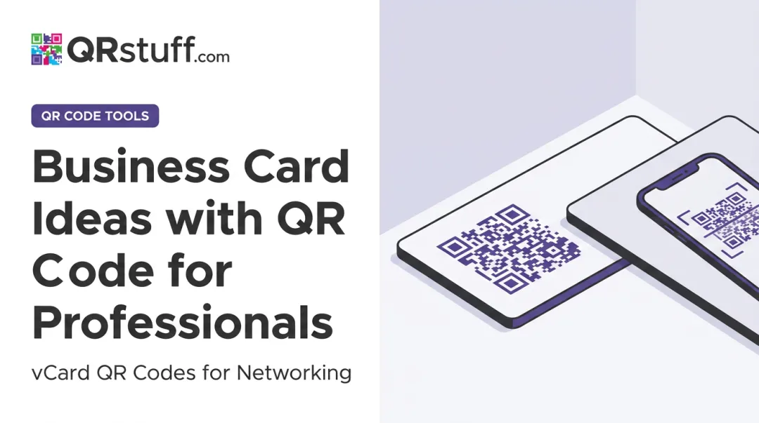
- Three methods: print icons + handles directly, use a QR code linking all profiles, or dedicate the card's back panel to social media
- QR code wins for multiple networks — one scannable element replaces multiple text entries and updates without reprinting
- Cap printed icons at 3–4 platforms on the card face; more than that hurts readability
- Source icons from official brand resource pages — Google image results often include outdated or rights-restricted files
- Icon size, font hierarchy, and white space determine whether your social section looks intentional or cluttered
Three Methods for Displaying Multiple Social Profiles
Method 1: Print Social Media Icons and Handles Directly
This is the most familiar approach — a row of platform icons with usernames beside them. It works well when you're featuring two to four high-priority accounts.
Getting the icons right:
- Download vector or high-resolution PNG files with transparent backgrounds from each platform's official brand resource page: LinkedIn Brand Resources, Meta Brand Resources, YouTube Brand Resources, and equivalent pages for X, TikTok, and Pinterest
- Never pull icons from Google image search — those files are frequently outdated, low-resolution, or altered in ways that violate brand guidelines
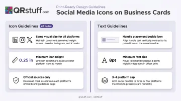
- Follow each platform's style guide before placing icons. LinkedIn requires a minimum print height of 0.25 inches for the [in] mark; Facebook sets a 6mm minimum width. Shapes, colors, and proportions cannot be modified
Layout guidance:
- Arrange icons in a consistent horizontal row with the handle immediately beside each icon
- Keep all icons the same visual size — a large LinkedIn badge next to a tiny Instagram icon creates immediate imbalance
- Use a minimum 8pt font for handles; special characters like @, underscores, and periods become unreadable below this size
- Cap the card face at 3–4 platforms. If you need more, route the overflow to Method 2 or Method 3
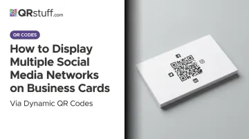
Method 2: Use a QR Code to Link All Profiles at Once
A single QR code can replace every printed handle on your card. When it links to a hosted social landing page, one scan takes contacts to a page listing all your profiles — no text entry, no searching, no outdated handles.
If you rebrand, change a username, or join a new platform, a dynamic QR code lets you update the destination URL without touching the printed card. Static QR codes can't do this — once printed, they're locked to their original destination.
QRStuff's Social Link Pages QR code generates a hosted landing page that works as a link-in-bio hub. Setup takes a few minutes:
- Add each platform link with its own CTA label
- Personalize the page with a header and brand colors
- Publish everything inside one scannable code
- Update destinations anytime on paid plans — no reprinting needed even if your card order spans 12–18 months
Placement rules:
- Minimum size: 0.8 × 0.8 inches (per both Nielsen Norman Group guidelines and QRStuff's own documentation); 1.2 × 1.2 inches is a safer choice for cards that may be scanned at arm's length
- Position in a corner or on the back panel to avoid competing with primary contact details
- Always add a short CTA label nearby — "All my socials," "Connect with me," or "Scan to follow" — because a QR code with no context gets ignored
Method 3: Dedicate the Back Panel to Social Media
The card's back panel removes the space problem entirely. With a full side available, you can cleanly present four to six platforms — icons, handles, and a brief CTA — without competing with your name, title, or contact details on the front.
Layout options:
- Vertical column: left-aligned icons with handles beside them, consistent spacing throughout
- Two-column grid: works well for four or more platforms with shorter handles
This method pairs especially well with Method 2. Place a QR code on the back for contacts who want to scan quickly, and print the handles alongside it for people who prefer to search manually. The combination covers both behaviors without cluttering either side of the card.
Which Platforms Should You Actually Include?
Including every platform you're on dilutes the card's focus. The goal is to point contacts toward where you're genuinely active and where contacts will actually follow through.
A 2025 VistaPrint survey of 800 US professionals found that 62% of respondents value a clean, organized layout on a business card. Every platform you add past the point of usefulness works against that.
Match your platform choices to where your audience actually looks for you:
| Role | Primary platform | Secondary platforms |
|---|---|---|
| B2B professionals / consultants | X, YouTube | |
| Creative freelancers / product businesses | Pinterest, Behance | |
| Personal brands / content creators | TikTok, YouTube |
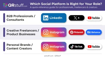
Give one primary platform the most visual prominence, then list up to two secondary platforms alongside or below it with slightly smaller icons. At a standard 3.5" × 2" card size, three platforms is the practical limit before the design starts to feel crowded.
Design Variables That Determine the Final Result
The right method still fails if execution is inconsistent. Five variables have the most impact:
Icon Sizing and Consistency
All icons must share the same visual weight — same diameter or bounding box. Mixing sizes creates imbalance that reads as unfinished. The verified print minimums (LinkedIn: 0.25 inches, Facebook: 6mm) provide a useful baseline; aim for uniformity across all platforms at roughly that scale.
Visual Hierarchy and White Space
Social media information should read as secondary to your name, title, and primary contact details. A thin divider line, a slight reduction in font size, or additional spacing above the social section all signal hierarchy without making handles unreadable.
That hierarchy only works if white space supports it. Research published in Applied Ergonomics confirms that visual clutter measurably impairs information search and retention — on a business card, every element added past the point of necessity makes the important elements harder to find. Leave breathing room around the social section.
Font Size and Legibility
UPrinting recommends 8–10pt for contact information on business cards. Treat 8pt as your minimum for handles. Handles with underscores or long character strings benefit from 9–10pt. Always print a physical proof before placing a full order — screen previews don't replicate print accurately.
Color Treatment for Icons
Full-color icons carry brand recognition but can clash with a strong card palette. Monochrome icons — all black or all white — are almost always cleaner on cards with complex backgrounds or dark base colors. When in doubt, monochrome is safer.
Common Mistakes Worth Avoiding
Three design habits consistently undermine an otherwise well-planned card.
Overloading the Card Face
Five to seven platform icons force every element into a size too small to read comfortably. Choose three to four platforms for the front and route additional profiles to a QR code or back panel.
Using Unofficial Icons
Icons pulled from third-party sources are frequently outdated, watermarked, low-resolution, or modified in ways that violate platform brand guidelines. Instagram, YouTube, LinkedIn, and X all explicitly require official assets only — modifications to color, shape, or proportions can constitute trademark infringement. Always source from official brand resource pages.
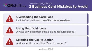
Skipping the Call-to-Action
A row of icons with handles is passive. HubSpot's analysis of 330,000+ CTAs found personalized CTAs performed 202% better than generic ones. That principle transfers directly to print: a specific prompt like "Follow for project updates," "DM for a quote," or "Scan to connect" gives the recipient something to act on immediately — not later (which often means never).
Frequently Asked Questions
How do you display social media on a business card?
Three approaches work well:
- Print icons and handles directly on the card face
- Use a QR code linking to a landing page that lists all your profiles
- Dedicate the card's back panel to social media
Combining methods — icons on the front, QR code on the back — covers both quick-scanners and manual searchers.
How many social media accounts should I put on my business card?
Three to four platforms maximum on the card face. Beyond that, icons and handles shrink to the point where they become difficult to read. If you need to share more than four profiles, a QR code linking to a multi-profile landing page is a better solution than cramming additional entries onto the front.
Can I legally use social media logos on my business card?
Most platforms permit it, provided you download official files and follow each platform's brand guidelines. LinkedIn, Instagram, YouTube, and X all allow logo use on printed materials as long as you don't alter the official assets' shape, color, or proportions.
Should I use a QR code or print handles directly?
Printing handles works well for one or two platforms where space isn't an issue. For multiple networks, a QR code is the cleaner option — and a dynamic QR code lets you update the destination if handles change without reprinting the card.
What's the minimum font size for social media handles on a business card?
8pt is the standard minimum for business card body text. Handles with special characters — @, underscores, periods — benefit from 9–10pt for comfortable readability. Always verify legibility with a physical print proof before ordering in bulk.