Introduction
Picture this: a QR code sits on a product shelf with no text around it. Most shoppers walk past. Now imagine the same code with "Scan to unlock your in-store discount" printed beneath it. Suddenly, it gets scanned.
That difference is entirely down to the call to action. The QR code is just the mechanism — the CTA is the reason someone stops and pulls out their phone.
Without a CTA, you're asking people to scan something without telling them why. A 2023 Chain Store Age survey found 98% of marketers reported positive QR code marketing impact — yet scan rates remain far below their potential. The gap comes down to one thing: most QR codes ship without the instructional copy that turns passive interest into an active decision.
What follows are real CTA examples across industries and placements — plus the principles behind why they work.
Key Takeaways
- A QR code CTA combines an action verb with a clear benefit — "Scan to save 20%" outperforms "Scan here" every time
- The most effective CTAs answer "what's in it for me?" before the user has to ask
- Context matters: restaurant CTAs, retail CTAs, and event CTAs each require different language
- Place the CTA directly above or below the code, never separated by other design elements
- Dynamic QR codes let you update the destination without reprinting, keeping your CTA accurate after launch
What Is a QR Code Call to Action?
A QR code CTA is the short instructional or motivational text placed near a QR code that tells users what action to take and what value they'll receive in return. The code is the delivery mechanism; the CTA is the reason to engage.
Without that text, users face a moment of hesitation: What is this? Where does it go? Is it safe? MobileIron's 2020 survey found that 71% of respondents couldn't distinguish a legitimate QR code from a malicious one. A CTA addresses that friction by setting clear expectations upfront.
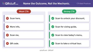
Weak vs. Strong CTAs
The difference is stark when you see examples side by side:
| Weak CTA | Strong CTA |
|---|---|
| "Scan here" | "Scan to unlock your discount" |
| "More info" | "Scan for sizing guide" |
| "Scan me" | "Scan to view today's menu" |
| "QR code" | "Scan to take a virtual tour" |
The pattern is consistent across every example: weak CTAs name the mechanic, while strong CTAs name the outcome. Users scan when they know what's in it for them.
What Makes a QR Code CTA Effective
Start with an Action Verb
Every strong QR code CTA opens with a command. Verbs like Scan, Unlock, Discover, Get, Watch, Join signal immediacy and make the next step obvious. The user knows exactly what to do without having to interpret anything.
Intuit's content design guidelines recommend keeping CTA actions to two or three words at most — that guidance applies here too. Brevity forces clarity.
Make the Value Explicit
The CTA must answer "what's in it for me?" before the user has to ask. The formula is simple: verb + benefit.
- "Scan to get free shipping"
- "Scan to see it in 3D"
- "Scan for today's specials"
Vague phrases like "More info" consistently underperform because they offer no reward signal. Users make split-second decisions about whether to scan — give them a reason in the text itself.
Keep It to 3–5 Words
QR codes appear on packaging, receipts, and signage where attention windows are measured in seconds. A long CTA won't get read. A short, specific one will.
4 words wins: "Scan for free shipping" vs. "Scan this code to find out about our free shipping offer" — no contest. Trimming forces you to identify the single most valuable thing you're offering.
That same principle of reducing friction extends to how many codes you place in one spot.
One Code, One CTA
Multiple CTAs near a single QR code split the user's focus and reduce scan intent. Each code should have a singular goal. If you want users to both view your menu and leave a review, use two separate codes — each with its own clear CTA.
Match the Landing Page to the Promise
This is where many campaigns fail. If your CTA says "Watch the demo" but the code opens a sign-up form, trust breaks immediately. Nielsen Norman Group's research on information scent confirms that users abandon paths when the expected destination doesn't match what they were promised.
If you're promising a discount, the landing page should show the discount — not a homepage with a banner somewhere below the fold. The CTA and the destination are a contract with the user; breaking it kills conversions.
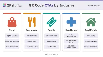
QR Code CTA Examples by Industry
The right CTA phrasing depends on who's reading it, where they are, and what they're trying to accomplish. Here's how effective CTAs look across key industries.
Retail
Retail CTAs succeed when they connect to immediate value — discounts, convenience, or product discovery. Chain Store Age's 2026 survey found that 75% of consumers use QR codes to get more information and 52% to find discounts, making those two motivations the strongest levers for retail copy.
Effective retail CTAs:
- "Scan to unlock your in-store discount"
- "Want more sizes? Scan here"
- "Scan to leave a review and earn a reward"
- "Discover new arrivals with a scan"
- "Scan to pay"
Restaurant and Food & Beverage
Restaurant QR CTAs should reduce friction and guide the dining experience. The goal is replacing a task the customer would do anyway — waiting for a server, asking for the bill — with a faster digital path.
Restaurant Dive reported that 47% of consumers were uncomfortable using restaurant QR codes, rising to 65% among consumers over 60. Plain, reassuring language matters.
Effective restaurant CTAs:
- "Scan to view our full menu"
- "Scan to order and skip the wait"
- "Scan for today's specials"
- "Explore our seasonal drinks"
- "Scan to pay"
Events and Entertainment
Event CTAs combine urgency with access. Scarcity language — "secure your spot," "register now" — performs well when seats or availability are genuinely limited.
Effective event CTAs:
- "Scan to register now"
- "Scan to secure your spot"
- "Scan to unlock the full event agenda"
- "Enjoyed the show? Scan to share feedback"
- "Scan for exclusive content"
Healthcare
Healthcare CTAs must balance clarity with reassurance. Patients need to feel confident about what they're accessing, not rushed into an unclear action. Words like "secure" and "your" add a personal, trustworthy tone.
For this reason, healthcare QR codes should link to verified, access-controlled destinations — not expose sensitive information through the code itself. QRStuff is GDPR and SOC2 compliant, which matters when codes are used in clinical or patient-facing settings.
Effective healthcare CTAs:
- "Scan for secure check-in"
- "Access your health records"
- "Scan for medication instructions"
- "Scan to update your health information"
- "Scan for patient leaflet"
Real Estate
Real estate CTAs work best when they offer more information without requiring any human interaction. Buyers browsing a listing sign at 7pm don't want to call an agent — they want instant access to what they need.
Effective real estate CTAs:
- "Scan to take a virtual tour"
- "Scan for property details and pricing"
- "Schedule a showing with a scan"
- "Download our buyer's guide"
- "Scan for updated listing info"
QR Code CTAs by Placement and Channel
Placement context changes how a CTA should be written. Print placements need more instructional language because users may need a nudge to scan, while digital placements can be shorter and assume readiness.
Placement Examples
| Placement | Sample CTA | Why It Works |
|---|---|---|
| Product packaging | "Scan for care instructions and tips" | Specific to the product's utility |
| Direct mail postcard | "Scan to claim your personalized offer" | Personal, time-sensitive framing |
| In-store signage | "Scan to find your size" | Solves an immediate problem |
| Restaurant receipt | "Scan to pay or leave a review" | Post-purchase actions, no pressure |
| TV/digital ad | "Scan to download the app now" | Urgency suits short attention windows |
| Business card | "Scan to connect on LinkedIn" | Personal and professional |
Physical Considerations
A billboard CTA needs to be legible from a moving vehicle — keep it to three or four words in a large, high-contrast font. A business card can afford something more personal and specific. The QR code itself also needs to be large enough to scan at the expected viewing distance — for signage, err on the side of bigger.
Digital placements like email and social can get away with shorter CTAs — users already have their phones in hand, so "Scan to download" is enough. Direct mail and packaging benefit from a bit more context. Something like "Scan this code to claim your exclusive offer" is still concise but gives less familiar users the cue they need.
Quick rule of thumb: the further someone is from the QR code (physically or contextually), the more guidance your CTA should provide.
Best Practices for QR Code CTAs
A/B Test Your CTA Copy
Even a single word change can shift scan behaviour. Testing "Scan to save 15%" against "Unlock your discount" on two versions of the same printed material gives you real data rather than assumptions. QRStuff's platform supports A/B testing by routing scans to variant pages and comparing outcomes using UTM parameters and key event metrics.
Test one variable at a time — CTA text, offer, placement, or landing page — and let the data determine the winner. Treat it as an ongoing process: each test sharpens the next campaign.
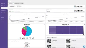
Track Performance with Real-Time Analytics
Good testing depends on reliable data, and QRStuff's analytics dashboard provides exactly that. It tracks:
- Scan volume — total scans and unique scans to distinguish reach from repeat engagement
- Device type — iOS vs. Android, mobile vs. desktop, for landing page optimization
- Geographic location — country and city level, useful for regional campaigns
- Time and date — identifies peak scan periods so you can time campaigns accordingly
- Campaign tags — organise and compare performance across different placements or initiatives
The Chain Store Age survey found that only 12% of marketers connected QR scans directly to revenue. Proper tracking closes that gap.
Use Dynamic QR Codes for Flexibility
With dynamic QR codes, the destination URL can be updated at any time without reprinting. A seasonal CTA like "Scan for our holiday offer" can redirect to a new promotion when the season ends, extending the life of printed materials significantly.
Dynamic QR codes are available on all paid QRStuff plans:
- Lite Suite (£4/month): 50 dynamic codes
- Full Suite (£15/month): 250 dynamic codes
- Enterprise (£185/month): 1,000 codes with unlimited bulk generation
Note that dynamic codes require an active subscription to maintain the redirect, so plan accordingly for long-running campaigns.
Design the CTA as Part of the Layout
The CTA should be visually integrated with the QR code — bold, readable font, high contrast against the background, positioned directly above or below the code.
QRStuff's customisation options let you add frames, borders, and text directly to the QR code design itself, so the CTA and the code function as a single visual unit. Never let other design elements separate the CTA from the code — both elements need to register in one glance.
Conclusion
A QR code without a CTA is a missed opportunity. The scan decision happens in a fraction of a second, and without clear text telling users what they'll get, most won't bother.
The best QR code CTAs are short, action-oriented, and honest about what the scan delivers. They match the landing page, fit the placement context, and get the same deliberate attention as any other element in the campaign.
If you're ready to put these principles to work, QRStuff gives you everything you need: fully customizable, branded QR codes across 40+ data types, dynamic codes you can update without reprinting, and a real-time analytics dashboard to track and test every CTA you run.
Frequently Asked Questions
What is a good QR code call to action?
A good QR code CTA pairs an action verb with a specific benefit in 3–5 words — for example, "Scan to save 20%" or "Unlock your free guide." It removes hesitation by telling users exactly what to do and what they'll get, rather than leaving the destination to imagination.
Can a QR code trigger an action?
Yes. QR codes can be programmed to open a URL, download a file, launch a map, connect to Wi-Fi, or initiate a phone call. The CTA tells users what action will be triggered; the QR code executes it when scanned.
Do QR codes need a call to action?
Technically, no — a QR code will scan without one. But adding a CTA significantly increases scan rates by removing uncertainty. Users who don't know what they'll get are far more likely to ignore the code entirely.
How long should a QR code CTA be?
Three to five words is the practical target. "Scan for free shipping" works where a longer explanation won't get read.
Can I change my QR code CTA after printing it?
The printed text can't be changed without reprinting, but with dynamic QR codes, the destination behind the code can be updated instantly. This means the underlying offer can evolve without creating a mismatch between your printed CTA and the landing page.
What are common mistakes to avoid with QR code CTAs?
The most common pitfalls: using vague language with no context ("Scan here"), placing the CTA far from the code, promising one thing on the CTA but delivering something different on the landing page, and putting multiple CTAs near a single code.